Learn how to use Brikl's no-coding, drag-and-drop page builder.
The Content Builder is a no-coding, drag-and-drop tool to build storefront and MicroStores pages quickly and easily.
Chances are that you'll intuitively learn how the Content Builder works by simply playing around with it, especially if you are familiar with other page builder tools, such as Elementor.
If you prefer to learn by doing, you can navigate to Store Design > Contents, pick a page from your content list (or create a new one) and start editing it in the Content Builder. But if you wish to get to know the Content Builder better before you start working with it, we'll cover the basics of it in this article.
☝️ To use the Content Builder, you must first create a new content page in your dashboard (Store Design > Contents). Visit How to create, add, and edit content in case you need help.
Content Builder Overview
Let's take a look at all the different features of Content Builder.
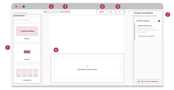
1. Component Library
The extensive collection of components you can use to design your page.
2. Draft or Published
You can keep your page private or public by switching between Draft and Published. Keep your page as a draft while working on it, and once you've finished, switch to publish to have it live for people and search engines to access.
⚠️ If you're working on storefront pages, deployment is necessary after you switch your page to Published. Storefront pages will be publicly visible only after deployment. Visit What is deployment and how do I use it? for more information.
3. Preview
Click "Open Preview" to open your page in a new tab and see the result of what you're building exactly the way your users will see it.
☝️ Always preview your pages before publishing them. Pages in the Content Builder might look slightly different compared to pages displayed in a separate browser tab.
4. Language
Use the language dropdown to visualize and edit your page in each language.
☝️To add multiple languages to your Brikl store, navigate to Settings > Language. Visit How to add languages for more information.
5. Device (Responsiveness)
See how your page looks across phone, tablet, laptop, and desktop screens.
6. Content Area (Canvas)
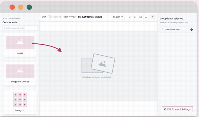
This is the area where you'll drop the components from the left sidebar.
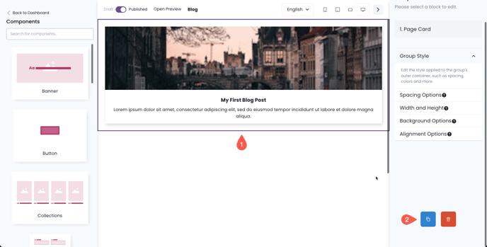
7. Customization Panel
Each component dropped to the canvas has several customization options: text, color, spacing, positioning, and many more.
After dragging a component from the component library and dropping it in the content area, click the added component to see the customization options at the right sidebar.
How to add, delete, and duplicate components
To add a component to your new page, drag it from the component library and drop it into the content area.
Duplicating and deleting components is easy:
- Click the component you want to duplicate or delete.
- Scroll down the right sidebar (the Customization Panel) and look for the blue page icon to duplicate the selected component or the red bin icon to delete it.